
Although I continue to stand by that assertion, the truth is that a number of TurboGrafx-16 games featured cover art that wasn't completely atrocious. In fact, some of it is downright acceptable (if not altogether amazing). Hopefully the five examples below--arranged in alphabetical order--will help prove that point.


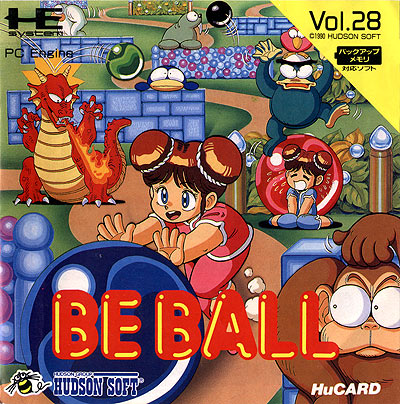
2. Chew Man Fu--It has to be said that this odd game's box art is far less interesting than its Japanese counterpart (called Be Ball). That said, it's appealingly colorful, and the illustration of the mustachioed dude serving as its focus isn't hideous. Because of that, I think it more than earns a spot on this list.

3. The Legendary Axe--Full disclosure: I've never been much of a fan of this gritty platformer, despite the fact that every other TurboGrafx-16 owner back in the day slobbered over it like it was a photo of Daniel Craig in the buff. I've always liked its cover art, though--thanks it large part to the humongous spider that takes up most of its acreage.

4. Monster Lair--Here's another piece of TurboGrafx-16 box art that I've long been a fan of. In fact, I prefer it and its muted pastels by quite a margin to the comparably bright art that graces the cover of the game's Japanese release (Wonder Boy III: Monster Lair).

5. Neutopia--I have a feeling this choice will divide viewers. Personally, I like its unique perspective and bold use of reds, oranges and yellows, but I'm sure some will find it to be the definition of gaudy. On which side of the spectrum do you stand?
See also: 'Five favorites: Japanese DS box art' and 'Five favorites: Japanese Wii box art'


8 comments:
TG-16 cover art is horrifying for the most part, I did my own feature on it a while back. Looks like you've chosen some of the better ones here though :)
Oh, I agree, Simon. Like I said in the opening sentences, MOST of it is hideous! I thought that back in the day when I actually owned a TG-16, and I still think it today :) That said, I do think some decent box art was created for the system's games--especially later in its life.
On the other hand, of course, the was some splendid Engine box art. Poor old Americans :P
Yes, Simon -- that's what made/makes the whole "TurboGrafx-16 box art sucks" problem so damn painful. The PC Engine was home to some *wonderful* examples of box art :)
I love that Neutopia art. The big shiny letters make it for me. You don't see that anymore (and probably for good reason), but I always loved it in its day.
You're right that you don't see such fonts today, Justin--and, yes, probably for good reason. Still, I'm like you and kind of oddly drawn to it, esp. in this case :)
Some other US covers that I like or don't mind: Double Dungeons, Night
Creatures, Timeball, Tricky Kick, Dungeon Explorer II, Lords of Thunder, Shape
Shifter, Ys Book I & II.
Hey there, IvaNEC! The only cover of that group that I can remember at the moment is Ys Book 1 & II, which I, too, think it pretty darn good. I don't remember the others, though, which means I'm going to be hitting up Google in just a second :)
Post a Comment