
Before we get to the cover art that's been created for the newest Umihara Kawase title, which will be released this summer for the 3DS, let's check out the covers that came before it.
For starters, here's the illustration that was used on the original Super Famicom release (which hit the streets in Japan all the way back in 1994):

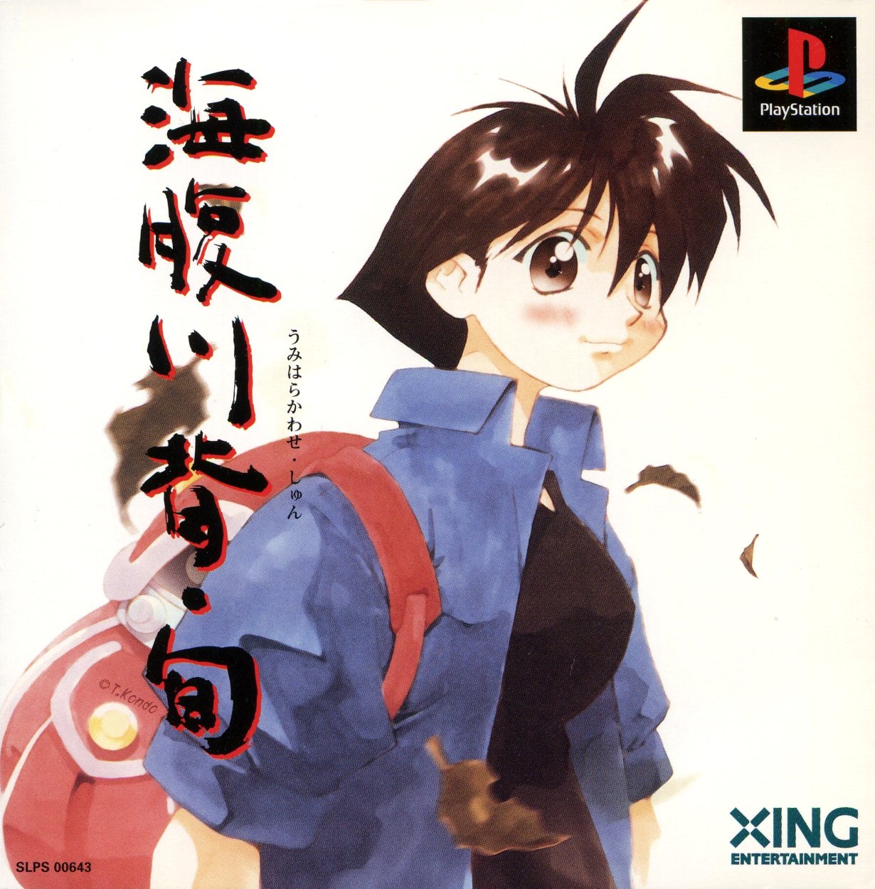
Three years later, Umihara Kawase Shun was released for the PlayStation, with the following piece of art gracing that version's packaging:
Strangely, Umihara Kawase Shun features between-stage commercials for a company called Mitchell. They were replaced (with pieces of illustrator Toshinobu Kondo's artwork) in a "Second Edition" of the game that saw the light of day in 2000. Here is that iteration's box art:

Fast forward eight years and you encounter Umihara Kawase Portable, a supposedly bug-riddled port of Umihara Kawase Shun:

That was followed a year later by Umihara Kawase Shun Kanzenban, a DS cart that contained both the Super Famicom and PlayStation titles as well as a handful of additional stages. Thankfully, it's reported to be bug-free.

Finally, we come to the recently announced Sayonara Umihara Kawase, a full-on sequel that's being developed by the same folks who made the series' initial offerings. Its cover art can be seen below.

Which piece of Umihara Kawase box art is my favorite? The one produced for the original pressing of Umihara Kawase Shun, no question. That said, I'm also pretty fond of the covers made for the Super Famicom and PSP releases.
I'm not much of a fan of Sayonara Umihara Kawase's cover art, sadly. It's by no means terrible, mind you, but it's also kind of boring--in my opinion, at least. Of course, all of the creations seen above are variations on a rather ho-hum theme, aren't they?
Now that I've had my say, what do all of you think? Do you prefer one example of Umihara Kawase box art over another?
See also: previous 'Which Box Art is Better?' posts


8 comments:
They are all pretty samey! I'm finding myself wishing for a really awful unused box art for the unreleased Yumi's Odd Odyssey, just to spice things up. :)
Anyhoo, I definitely like the original PSX release, with its hand-painted quality, and I also like that the leaves on the cover are brown, which reflects the leaves in-game and matches a certain autumnal feeling that I think the game has. Sakura blossoms are a Spring thing, aren't they? That said, I also really like the bright colors and slick quality of some of the other boxes and feel that the DS version is the high point of that, Kawase-san has a more active posture and I like the soft pink coloring, I think it's my favorite overall.
The PSX re-release is the first one I played and ought to hold some nostalgia but looking back on it I can't help thinking it kinda looks like a porn title. What's up with her expression??
Oh, I'd love to see whatever cover art was developed for Yumi's Odd Odyssey, too, Michael. I can only imagine how terrible it probably is/was :|
I'm kind of surprised to hear that you like the DS cover the best. Although, I'm not entirely sure why I feel that way as, like I said in the post, they're all very similar and its hard to say one is loads better or worse than the rest.
As for the PSX re-release's art being a bit weird: I agree! I can't imagine why they'd choose that illustration for the cover. Of course, I also can't explain why they chose the illustration they did for the Sayonara cover, so ...
Young Kawase has a similar expression, too. I guess they just "know their audience?" It's a little creepy imo!
I agree that it's creepy. Also weird that they've yet to try a cover that's more action-oriented. After all, the game isn't a visual novel, etc.! Oh well, at least the games themselves are fun (if sometimes/oftentimes frustrating).
On the one hand the sameness and focus on only the character gives the series a certain feel that's kind of interesting and introspective and makes you wonder if there's some sort of plot or meaning to the game, considering how many other options they had for cover art. In a game about a kid flying around the scenery with a fishing pole they could have done any number of action packed illustrations.
My theory then is that they had a guy who could do characters, but wasn't proficient with background illustration or unusual perspective. That would explain the simplistic level graphics and use of digitized photos for the backgrounds instead of pixel art too. I completely pulled this idea out of my ass and know nothing about the illustrator for the series though! Maybe that's just how they wanted to do things. To get to the point, I'm no great fan of any of the covers but I also prefer the original PSX art.
I saw that Tiny Cartridge linked to this post today by the way, congratulations on the publicity!
I agree with your first comments, Jeremy--that the sameness of this series' box arts gives them an introspective, and dare I also say iconic, quality.
That said, I also agree with your second set of comments--about the illustrator maybe not being so great at unusual perspectives or action-oriented works, etc.
BTW, I didn't know until now that TC had linked to me--which is weird, as I check that site every day! Anyway, thanks for the heads up :)
Wow, it's like they went "How can we make this worse with each iteration?" :|
Love the original.
I love it, Simon! I don't completely agree with it, but I certainly agree that the first two covers are the best :)
Post a Comment